Wednesday, May 8, 2013

Memento Mori


Progress report!!  Making transparencies of things is fun, but it's getting tedious!  I'm not very good at photography, so just getting images for this has been quite the trial.


Finished importing images to the project. Pathing selections and making transparencies to paste in took absolutely forever, but it's done!  Ended up removing the coffee stain texture because it looked really sloppy and the picture was already pretty busy.

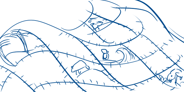
Speaking of busy... I was initially worried about how cluttered the image is, and spent a lot of time trying to figure out how to alleviate the clutter... however, I've realized that it's a pretty fair representation of who I am at this point in time.  I am extremely cluttered and overwhelmed lately, so it kind of gets reflected in my self-analysis.  Anyways.  At some point along the way I managed to lose my editing on the coloration, so the whole thing got eye-blindingly bright again...


05/09 - So I've gone and fixed the coloration so the image is less blinding. Smoothed the buttons, fiddled a bit with some of the opacities. Think I'm done!

Wednesday, April 24, 2013

Stroke


Palette project: Learning to adjust dry/wet settings, experimenting with different brushes, etc.  FINALLY PAINTING!!!  YAY!!


So this was a really fun project... ended up settling on a very short stroke style.  The example dealt with much longer, smoother strokes... but I got uncomfortable trying to get long, smooth strokes with a mouse.  Ended up going with something influenced by impressionism--lots of shorter strokes, especially on the trees.  Once that feel together, it got easier and more fun. 

Monday, April 15, 2013

Stylize

source
So I was discussing my project with my professor, and she suggested that I take a look at Milton Glaser's Bob Dylan for further inspiration on more abstract, stylized hair for my portrait.  After some thought, I ended up deciding to redo things a bit and get more detailed.  I'm much happier with the result.


04/15 class - Colouring the hair in more detail will be the next step! 


04/15 evening - Colouuuuuuurs. 


04/17 class - Imported the portrait onto the final image... starting to work in other images.  Thus far I've been placing images as hard light layers for the most part.  Some have been grayscaled in order to keep a red/orange colour uniformity.  I'm a bit torn between making them easier to see and leaving them as is.  The image is a bit busy as is, which is concerning, and making the individual images easier to see will make it even busier.  On the other hand, I'm a little worried that I've got too much focus on my portrait--it's hard not to be biased in favour of it, since I spent so much time on it... I don't know, we'll see.


04/17 class - Oh, yeah, there's also a texture on this.  Coffee stained paper, but I'm not sure whether or not I want to keep it.  I may test some other textures later.  Added colour-coded buttons, debating whether to add text labels to them.  Depends on how abstract this is going to be overall, I guess.  This is kind of getting out of hand.

Victories thus far: 
  • Colours are no longer blinding, which is a problem I had before.  
  • Hair is a bit more stylized, which I like.

Worries:
  • Too much colour?  Too busy?  I'm worried it's just getting overdone and overcrowded. 
  • Portrait overly dominant?  I like it better this way, but I'm not sure this places much of an emphasis on this as a Photoshop project specifically...

Monday, April 8, 2013

Kaleidoscope


In-class practice with adjustments.  Worked primarily with Hue-Saturation, Colour Balance, Duotones/Tritones, and Curves.  

My goal here was largely to defamiliarize the image to some degree.  It's still obviously a bunch of flowers, but the original image...


... featured a single blooming flower with several dead ones underneath.  I did my best to saturate and modify the colours such that the wilted flowers ended up looking more like exotic, alien floral forms instead.  Probably poisonous, given the bright colours!  Touch at your own risk!

Wednesday, April 3, 2013

Breathing

I have begun work on my mind map!  Rough hair test, colours, etc.  Overlayed the original photo to make it a bit brighter and bolder.  I'm quite pleased with the result.  

Note to self: Photoshop doesn't like SAI files, and the Photoshop file is too big for SAI to handle.  Lots of saving images and importing them back and forth.  Painting happens in SAI, images are saved, are imported to Photoshop and edited there.


Further progress!  Background has been painted, lots of flowy rainbow lines.  I may end up repainting the self portrait.  We'll see.  Someday I'll get around to my facial features and the rest of the photoshopping.

Monday, April 1, 2013

Application


Just a couple of pieces I did on the side.  My roommate got an assignment to put together an advertisement image for a business class, but it was kind of not useful for her and she doesn't know how to work with Photoshop or anything of the sort.  Walked her through doing these simple effects in PS and had a good time!

Stock images by:

Unpolished


Categories:

  • Art
  • Dreams
  • People
  • Gaming
  • School
  • God
  • Race
  • Anxiety
  • Literature
  • Writing
Concept:


The idea here is to take an image of my Wacom tablet and fill the "screen" with a collage that represents me.  The tablet has eight smaller buttons and a larger pair of concentric circular buttons, giving me nine or ten categories, which is perfect.  The categories will be divided by colour in an organic fashion, with relevant images collaged within their respective categories.  On top of the collaged categories will be a self-portrait, because I don't like photographing my own face. XD  The main part of the head will be opaque, but the hair should fade out/blend into the collage towards the ends. 

Draft:


Very rough concept work, just blocking in possible section layout and such.  I can't do a lot until I get photos taken, which will take some time outside class.  This is just a horrible, horrible draft thrown together with non-stock images for lack of resources in class at the moment.  Will be replaced when I get something legitimate together.


Here we go. An actual, unedited photo of my lovely tablet. <3

Sunday, March 24, 2013

Heart on my sleeve

Preparation for the Mind Map / Collage project.  It's a bit of a mess.

Word list:

I couldn't do this in a sane manner.  It was either everything or nothing, so it ended up being everything.

note to self: 11x17 inches, CMYK.

Inspiration images:


"Paper Doll" by PearlIsabel
"Farbenspiel" by Loonaki


"snipingsniper" by plutonium

Monday, March 11, 2013

Patchwork


Final result. 

I've thoroughly enjoyed working on this project, as it finally gave me the chance to express something of what I love about Photoshop, dealing with a subject that interested me visually.  I think it shows! 

Stock sources:
All these artists can be found at deviantart.com.  

Tuesday, March 5, 2013

Brighten


First draft of my zoo billboard practice!  I'm really enjoying playing with the saturation, light levels, and colours of this piece.  So far, I've darkened the background and cast a strong oversaturation on the snake, and I've begun adding all sorts of animal textures and skins as a mixture of hard lights and overlays, which I find works quite nicely for my purposes as it allows the scales to show through in varying opacities.

EDIT: oh gosh, forgot credits. *facesmack*  I shall add those tomorrow morning when I get back to working on this.  It's late and past my bedtime now. 


EDIT: Did some more work in class.  The background still needs work, but I'm quite happy with how the snake is coming along.  Still need to remember credits, because I'm incredibly dense and forgetful.


EDIT: Credits added, background blurred and darkened.


EDIT: Experimenting a bit with the background--lightened, threw a gradient over the top.


EDIT: Kept the gradient, removed the blur in favour of a posterized look.


EDIT: Fiddling with the background is just way too much fun.  In other news, added the Tulsa Zoo logo!!  I think I'm going to leave the right side open, because on an actual billboard it's likely there would be some amount of text, and maintaining space for that seems like a good idea.


EDIT: Just fiddling with logo size/location.


Repertoire


Just finished the latest lesson, learning a bit about filters and smart layers.  Not quite as exciting as paths, but hey, it was an interesting project, if the end result is a bit tacky for my tastes! :)

Sunday, March 3, 2013

Essence

Zoo, for me, can be stripped down to just a few words out of the list I posted before in "Distill."  In its essence, it is sensory--textures, sounds, colours, patterns, smells.  The zoo is a place where many different things become part of a whole.  It's an epitome of diversity, where the senses are truly rewarded.  In essence, I think less about animals, and more about the things that make them up, distinguish them, and make them similar.  I tried to breathe that sense into my concept sketches, and I'm quite happy with some of them!

I think my favourites have to be the snake and the quilt.  Both convey the sense of the gorgeous patchwork that the zoo is to me, like a miniature version of the cosmos with all its curiosities and sights and sounds and experiences.  They also require a bit more of a blending type of Photoshopping than something like the tails or the city/junglescape, which are more about cutting things out and pasting them onto a common background.  I'm more interested in making things mesh together, rather than just plain collaging, so either will more interesting and challenging for me to work with, from a technical standpoint.  


Upwards

Sky Lands, by Ehecod
An artist I've started following closely in the past months is Ehecod, whose ability to capture landscapes of great depth, atmosphere, and emotional value is absolutely stunning.  In addition, he often puts together GIFs of his progress, giving some insight into just how amazing a grasp of forms, light, and shadow he has.  Not only is he amazingly talented, but his attitude is so friendly and down-to-earth that it's a joy to follow him and see his updates, because he's still learning and not afraid to ask for feedback, thank people for their comments, and offer advice of his own.  I'd say his work is well worth a look!

Wednesday, February 27, 2013

Distill

Zoo
exotic
foreign
wonder
education
patchwork
noise
colours
patterns
textures
sensory
jaguars
tigers
giraffes
elephants
pandas
monkeys
peacocks
zebras
ostriches
birds, birds, birds
snakes
spots
stripes
speckles
freckles
fur
scales
skin
hair
feathers
masks
footprints
claws
paws
eyes
petting zoos
trees
habitats
ecological
biomes
water
ice
sand

A study in retro


Lesson 8 project!  Learning to use PS tools, as usual. 

Monday, February 25, 2013

A light

Quiet present of light and shadows, by Janek-Sedlar

Possibly more relevant to the current class work with photographs and photomanipulation, I'd like to feature Janek-Sedlar, whose amazing photography is coupled with a professional skill with manipulation which produces pieces that are not only beautiful, but unearthly and ethereal.  Everything this artist puts out is perfectly polished--a prime example of both a photographer's eye and an admirable ability to highlight and enhance the best features of a photo.  Browsing Janek-Sedlar's gallery is like walking into a fairytale, a journey you won't regret.

A piece of heaven

The Kiss, by Kaytseki
Stylewise, Kaytseki is probably my favourite artist in the entire world.  Her work is a peculiar blend between traditional painting and the manga look from Japanese comics, coupled with an excellent taste in colour and a lovely, opaque painting style that draws the eye to shapes and yet coheres into a whole. I can't quite describe it, so you'll just have to look!  I can't praise her enough.  Everything she does is sensitive and gorgeous, a perfect blend between the strength and fragility.  She takes the best advantage of the possibilities of the digital art medium, creating a fusion between the richness of traditional painting and the cleanness of digital work to make something uniquely ethereal.

I'm sorry, my words are everywhere.  I just adore this artist in every way imaginable.  Go check her out!

Room for Improvement


Well, guess I wasn't finished after all.  Maybe this is it.